This is one of those topics that leaves you wondering what all the fuss is about, until you actually realise there is more to it than meets the eye. You realise that it is more than just a drawing on paper, and how, something as “simple” as a map can be used as a tool that changes percpective.
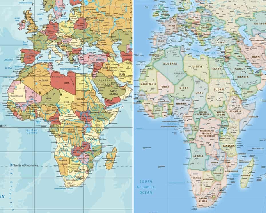
For generations, children around the world have looked at the same familiar world map in textbooks and atlases. In it, Africa appears smaller than many people imagine, almost appearing to be equal in size to Greenland. Countries in the northern hemisphere seem enormous, while much of Africa appears squeezed towards the middle of the map.
But that picture is not an accurate representation of the world’s land masses. Now, the United Nations has taken a major step towards changing how the world sees Africa.
On September 4, 2026, the UN General Assembly voted overwhelmingly in favour of a resolution promoting a new world map based on the Equal Earth projection, which represents the relative size of continents much more accurately than the widely used Mercator projection.
The vote was 164 in favour, one against and six abstentions – with the only country voting against the resolution being the United States.
How the UN Vote Happened
The resolution was spearheaded by Togo, with backing from the African Union, following the wider #CorrectTheMap campaign.
As we previously explored in Why the African Union Is Fighting to Correct the Map of the World, the campaign argues that the way Africa has traditionally been represented on world maps has contributed to a distorted perception of the continent’s actual size and importance.
Togo’s Foreign Affairs Minister Robert Dussey made the argument bluntly before the vote.
“This discussion is not a political discussion [but] a scientific discussion, because there is scientific proof so we all have to accept the reality.”
The resolution itself says disproportionate cartographic representations, particularly those resulting from the Mercator projection, have had lasting cognitive, educational, cultural, geopolitical and socioeconomic effects, including reducing the perceived size of Africa. But not everyone agreed that the UN needed to weigh in.
The United States was the lone country to vote against the resolution. Its representative described it as “superfluous”, while the US argued that the measure promoted an ideological agenda and distracted from what it described as genuine international problems.
Still, that did not stop the resolution from passing by an overwhelming margin.
So, Why Does Africa Look So Small on the Traditional Map?
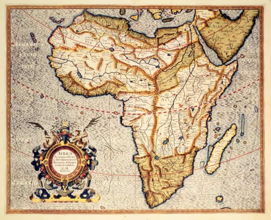
The culprit is the Mercator projection, created by Flemish cartographer Gerardus Mercator in 1569.
It was not originally designed to make Africa look small. Mercator created the projection primarily to help sailors navigate, and it remains useful for certain navigational purposes.
The problem comes when the projection is used to compare the actual size of countries and continents. The further land is from the Equator, the more its apparent size is exaggerated. This means Greenland looks dramatically larger than it really is, while Africa appears comparatively smaller. The difference is enormous.
Africa is about 14 times larger than Greenland, even though the traditional Mercator map can make the two appear surprisingly similar in size.
Another way of putting Africa’s scale into perspective is this: the United States, China, India, Japan, Mexico and much of Europe could fit within Africa’s land area, with room to spare.
And that is why advocates say the issue isn’t simply about making Africa look bigger, but making the map tell the truth about relative land area.
What Will Actually Change?
The new map being promoted is the Equal Earth projection, developed in 2018 by cartographers Bojan Šavrič, Bernhard Jenny and Tom Patterson.
Unlike Mercator, Equal Earth is an equal area projection, meaning the relative sizes of land masses are preserved more accurately. It is important to note, however, that the UN has not banned the Mercator map.
UN General Assembly resolutions are not legally binding, meaning countries, schools and companies are not being forced to throw away every Mercator map immediately. The resolution instead encourages the wider adoption of Equal Earth, particularly in education, public communication, technology and other areas where world maps shape people’s understanding of geography. And some changes could happen fairly quickly.
Togo says it intends to change its own school geography materials by the end of 2026, with Dussey saying:
“Togo will be the first country to change our own geography books.”
The country also plans to encourage other governments, schools, international organisations and technology companies to adopt the Equal Earth projection. Discussions will include companies involved in mapping, GPS and other location-based technologies.
Togo is also planning an implementation event in Lomé in the first quarter of 2027 involving UNESCO, the African Union and technology companies including Google Maps, according to The Guardian. That means the impact of Friday’s vote could eventually reach far beyond printed classroom maps.
It could influence the maps children see in school, the graphics used by media organisations, educational materials and potentially the digital maps people encounter every day.
France has already announced that it will move away from Mercator, adopting the Eckert IV projection, which is also designed to represent land areas more proportionately.
For Dussey, the change is about more than cartography.
“To those who say why now, I say: why not?”
He added that when people look at the world map, “it is time for us to change the narrative.” And perhaps that is the most interesting part of this entire debate.
Changing a map does not physically make Africa any larger (Africa has always been this big) instead what changes is what people see when they look at it.
After centuries of seeing Africa reduced on one of the world’s most familiar maps, the continent now has the backing of an overwhelming UN vote to present its true scale more accurately.